NEW!
Science Scope

|
Eyes In The Sky: The Big Picture by Lisa Young |
||||||||||||||||||
|
*Note* The article that appears in Science Scope magazine and the new Science Scope section of this website is based on the following article. They are not identical. The following article might read like a science fiction script. But it explains how scientists from various disciplines use satellites to study everything from tiny ocean organisms to global climate change. In this story, a research crew that uses high-tech sensors mounted on satelllites gathers information about Earth without physically contacting it. Satellite ocean technology has provided scientists with "eyes in the sky" that enable them to see the water world we call Earth in a whole new light. Join us in our mission to explain how oceanographers get "the big picture." The Mission: To collect information about the oceans, atmosphere, and land using data from an assortment of satellites orbiting Earth. A crew of scientists must address five major areas of oceanographic research: El Nino, algal blooms, storms and sea level rise, natural disorders, and coral reef ecology. |
||||||||||||||||||
|
(If you've
been following the Making Waves series, these topics should sound
familiar. Hit the Making Waves web site for a refresher! The primary goal of the mission is to enlighten the readers and crew about the versatility of satellite ocean technology. The Oceanography
Crew: The Guidelines:
Only remotely sensed data can be used to accomplish this mission. |
||||||||||||||||||
|
|
|||||||||||||||||
|
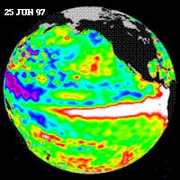
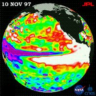
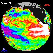
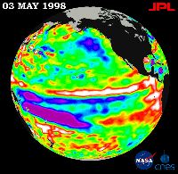
1. El Nino Dyna McCirculation: I used sea surface height data from the TOPEX/Poseidon satellite to monitor the progression of the 1997-1998 El Nino in the Pacific Ocean.
The height of the sea surface corresponds in part to the temperature of the water; warmer water is "higher" while colder, denser water is "lower." In these images, areas of red and white indicate sea level height well above average (water that's warmer than usual); purple and violet indicate below-average sea level height (and colder water).
The April 1997 image shows an area characterized by above-average sea level height getting sloshed along the equator toward the Americas by east-blowing winds.
The June 1997 image shows that the warmer (higher sea level) water traveled across the Pacific and started spreading along the coasts of North and South America.
In November 1997, El Nino peaked; sea level reached as high as 35 cm above average in parts of the eastern Pacific. Above-average sea level conditions were evident as far north as Alaska and as far south as Chile.
By February 1998, El Nino began to dissipate as the warmer (higher sea level) water receded toward the equator.
By May 1998, the eastern Pacific was returning to normal. However, the western Pacific had not yet returned to normal; the colder (lower sea level) water, which lingered for several months, affected weather conditions around the world.
Fisher Reese: The warm waters that encroach upon the west coast of the Americas during an El Nino event significantly impact the food chain, all the way up to humans. Normally, upwelling along the Pacific coast brings cold water and nutrients to the surface; the nutrients support a healthy population of phytoplankton, the tiny ocean "plants" that form the base of the marine food chain. Two images illustrate cold water upwelling and phytoplankton productivity along the west coast of the United States: the Advanced Very High Resolution Radiometer (AVHRR) image shows sea surface temperature, and the Coastal Zone Color Scanner (CZCS) image indicates phytoplankton pigment concentration (which corresponds to productivity). In the AVHRR image, purple and blue denote cold water; in the CZCS image, red and yellow indicate high phytoplankton production. Cold water and high productivity typically characterize the Pacific coast. However, this pattern is disrupted during El Nino, and fish harvests drop dramatically. Satellites help us better understand and predict phytoplankton productivity so we can improve how fisheries are managed.
|
||||||||||||||||||
|
2. Harmful Algal Blooms
Fisher Reese: First, here's some background information to skim before I explain how I used satellites to study harmful algal blooms. Algal blooms are natural phenomena that occur when a combination of factors such as sunlight, nutrients, and water temperature encourage the growth of one particular species of phytoplankton over others. Algal blooms are considered harmful if they produce toxins that adversely affect sea life or humans. For example, Gymnodinium breve, a common bloom species along the west coast of Florida, produces a neurotoxin that can contaminate shellfish and make beachgoers cough. Anoxia (oxygen depletion) can also lead to massive fish kills associated with harmful algal blooms. Impacts on public health, local ecology, and tourism underscore the need to study and monitor harmful algal blooms - and satellites can help. |
|
|||||||||||||||||
|
Algal blooms are often called "red tides," brown tides," or "yellow tides" because the abundant phytoplankton actually color the water. Therefore, satellites that measure ocean color, such as the Sea-viewing Wide Field Sensor (SeaWiFS) and CZCS (the predecessor of SeaWiFS), are ideal for detecting and monitoring blooms. This 1978 image of a G. breve bloom off the southwest coast of Florida is one of the first ever obtained by CZCS; this image is an "oldie" but a "goodie." The red, orange, and yellow areas indicate high phytoplankton concentration. Using satellite data, I can determine the concentration of the phytoplankton and measure the extent of a bloom, which are tough to measure from a ship. However, I still need to make initial measurements on land to confirm what the satellites are telling me. View the image here. Sally Nitty: I can use satellite sensors to detect chemical markers that signal the end of an algal bloom. Phytoplankton populations can decline for several reasons including: the cells run out of nutrients, zooplankton eat them, sunlight diminishes, or water temperature changes. As phytoplankton die, their cell structure breaks down; "dead materials" are released that give us different signals than live phytoplankton do. The old CZCS sensor was not sensitive enough to make a distinction between these different signals. Fortunately, the new SeaWiFS sensor measures light at the wavelengths that do reveal the difference so we don't overestimate productivity and misinterpret the signals. 3. Storms and Sea Level Rise Dyna McCirculation: Satellite sensors are lifesavers when it comes to hurricanes. Sensors help us to determine the strength and speed of a hurricane and, more importantly, to make predictions about the path of a hurricane. With advance notice, people who live in the path of a storm can protect themselves and their property, and if necessary, evacuate to a safe location. View the image here.
4. Natural Disasters Sally Nitty: Oil spills might be considered more of an "unnatural" disaster, but their impact on the environment is real nevertheless. Surprisingly, major spill events make up just a small percentage of oil pollution overall, but they can be devastating. Satellite imagery is often indispensable in the case of major ocean oil spills such as tanker accidents; we use it to measure the extent of a spill and predict its movement.
Sandy Bottoms: I used three Landsat images to study the effects of the eruption of Mount St. Helens in southwest Washington on May 18, 1980. View the images here.
The first image shows Mount St. Helens about seven years before the eruption. The white area of the image signifies snow and ice surrounding the mouth of the volcano. The rest of the image is red, which indicates forest vegetation.
The next image, taken a few years after the eruption, shows the extent of the devastation. The top 1,300 feet of the once mile-high mountain was lost in the landslide of rock and debris. The grayish-blue areas represent more than 150 square miles of devastated forest that are now mud and ash.
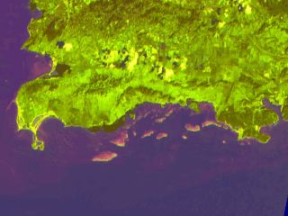
The final image, obtained about a dozen years after the eruption, shows the forest gradually making a rebound (light red). 5. Coral Reefs Sandy Bottoms: Coral reefs are typically found in shallow, clear water. They can often be viewed from space with sensors that use visible and near infrared wavelengths.
This Landsat image shows the southwest portion of Puerto Rico. The offshore reefs are clearly visible (shown in pink/green). We can use satellite images to map reefs, monitor changes in sea-bottom habitats, and look for signs of disease or trauma in the reef community. Fisher Reese: Many of the organisms that live on a reef fluoresce; that is, they absorb light and radiate it back out at a longer wavelength. In the following photographs, various reef creatures fluoresce particular colors (visible light) after exposure to a flash of UV light (shorter wavelength than visible light). View the images here.
The color varies depending upon the organism, allowing scientists to identify species of coral and other reef organisms based upon their fluorescence signature. A fluorescence sensor mounted on an unmanned underwater vehicle identifies species and creates bottom maps far more quickly and comprehensively than divers could survey the area. With a little more ground work, we may soon be able to use satellites to map larger areas, which would enhance our ability to monitor reef health and study species dynamics. Conclusion: These reports highlight just a few of the amazing capabilities of satellite sensors. There are significant advantages to using satellites for ocean research; the two most important are repeatability and coverage. A satellite sensor can regularly repeat its measurements day-in and day-out for many years. The sensor's ability to track information over long periods allows us to assemble time series data to answer questions about weather patterns, productivity cycles, pollution, and climate change. Like a child's growth chart, time series data help us see patterns, make predictions, and develop long-term plans. Satellites also enable us to measure large areas over short periods of time. Some satellites can cover an entire ocean in less than an hour, or even the entire globe in just one day! In contrast, we could send out thousands of ships at once, and many days later would still have only sampled a tiny portion of the oceans. Thanks to satellites, our "eyes in the sky," we have a much clearer picture of the workings of the water world we are so fortunate to call home. |
||||||||||||||||||